Analysis of wall painting

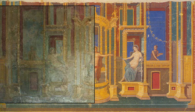
Figure 1. Juxtaposition of photograph and watercolour copy of the fresco from the west wall.
Mastracchio's design, when compared with a photograph of the original fresco, is revealed as a very precisely measured copy. Some minor differences towards the extremes of the fresco may be attributable to subsidence. The Mastracchio design, with its superior clarity and detail, therefore represents a sound basis for both perspectival analysis and 3d modelling.

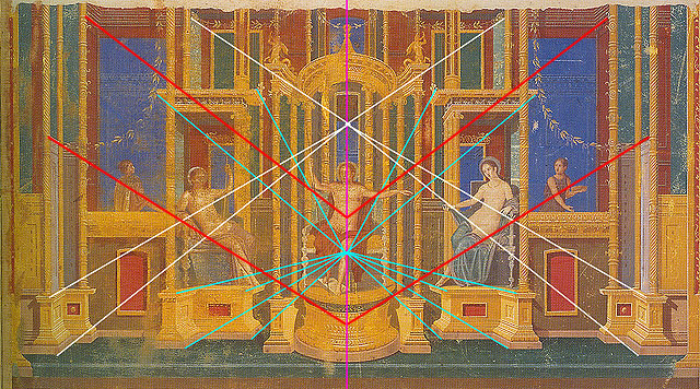
Figure 2. Perspectival analysis of Mastracchio's 1841 copy of the west wall fresco.
In the Mastracchio copy, three perspectival strategies can be observed: one case of parallel perspective (indicated in red), and two separate perspectival points (white and blue), all of which arrange themselves symmetrically on either side of a central axis (purple).
Key to Figure 1.
- The purple line represents the central axis of perspective. All lines of perspective in this painting intersect at this line which corresponds exactly with the central axis of the architectural structure in this painting.
- Blue lines show that the central core of the structure uses its own single point of perspective connecting with the central axis 1/3rd up from the base of the structure.
- White lines show that the base of the outer wings connect with the top recess of the central structure 2/3rds up the central axis.
- Red lines show the separating panels in the outer wings using parallel perspective.
For an overview of perspectival analysis see: de-coding perspective in skenographia
< back to The House of Apollo contents
